There is an old truism in the design world: Form Follows Function. Most of us first heard this concept in relation to the design of physical things, especially in architecture, but designers of all types have embraced it as a useful maxim. The idea is that a designer first needs to ask the question, “How does a certain thing need to function?” or “What does the end user need that thing to do?” before setting out to design it. Sounds logical, right? The opposite just does not work; if we put form first, with little or no attention to function, it may be a decent design, but it’s unlikely to function optimally for a specific purpose.
This is a little harder to keep in mind in the digital world, but it is no less true. The problem is that the “forms” we deal with are less often physical things and more often visual representations on our screens. Problems arise when items might look the same on your screen even though they are produced by different forms (aka file types).
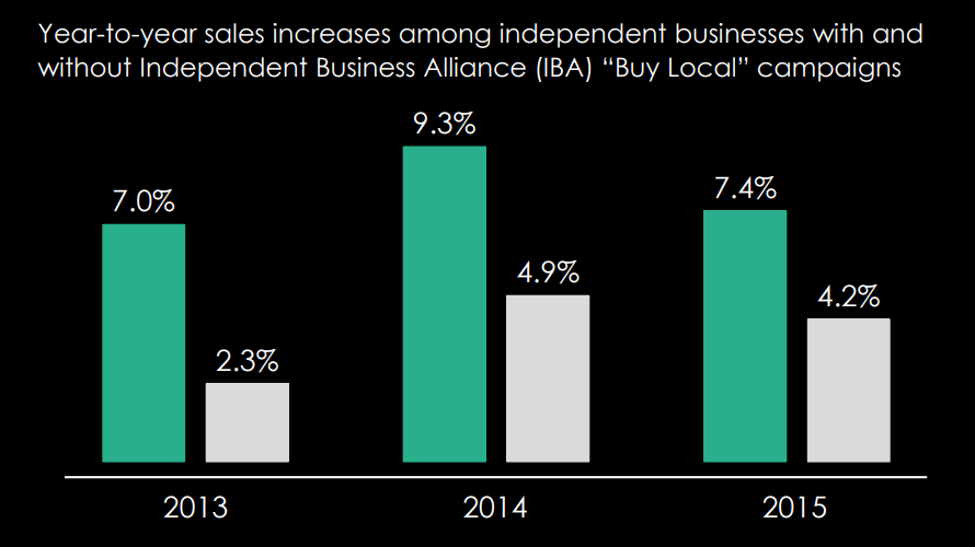
Consider a simple bar graph. This common graphic can easily be rendered as a JPEG, a PNG, a PDF or generated by and embedded in an Excel sheet. On our screens they may look almost exactly alike, but the functions they serve are dependent on their forms, and therefore the form (the file type) chosen to display the bar graph should be dictated by its function.

So, the relevant questions might be:
- Do we need the bar graph for a website or a social media post? Then a JPEG is probably best.
- Does it need to be overlayed on a particular background? Then a PNG with a transparent background is the way to go.
- Need to email it to someone, or perhaps blow it up a little to print on an 8.5” x 11” sheet? PDF is the way to go.
- Might the data, axes, legend, or colors need editing in the future? Then we probably should use the Excel file.
Since the form or file type we end up with is important (because it affects the way the item functions), then the way we create it is important as well.
While it might seem expedient to design multipage documents with PowerPoint, it is not really a design application. Instead, Adobe InDesign is the way to go, especially if the document needs to be printed. As advertised, PowerPoint is a presentation application. So, if your presentation ultimately needs to be printed as a brochure, there is no magic format button that turns it into a printable brochure file. Although it may look like a normal size landscape orientation sheet on your screen, your PowerPoint slide is not 8.5” x 11” (widescreen is actually 13.33” x 7.5”) and will not easily convert to a professional edge to edge printable format.
There are dozens of other examples, and believe me, our team of designers here at Princeton Creative have dealt with these issues for decades. But suffice it to say, Form Still Follows Function.


